OEE that means something: definitions before dashboards
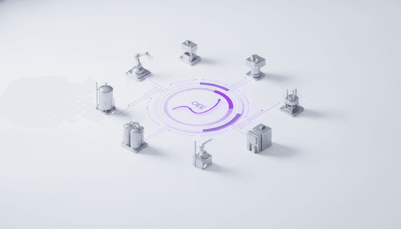
OEE is one of the few manufacturing metrics that everyone recognizes and almost nobody computes the same way. It is the product of three ratios — availability, performance and quality — and each of them depends on a definition that is chosen rather than measured.
That is what makes the single number so easy to move without improving anything. In practice, the discipline that works is to fix the definitions first, publish them, and only then build the dashboard.
Three ways the number goes up without the line getting better
Each component has a choice built into it, and each choice has a way of inflating the result.
- Planned downtime. Availability compares run time to planned production time, so anything reclassified as planned leaves the denominator. Reclassify a recurring changeover as planned maintenance and availability improves without a single minute of extra output.
- Ideal cycle time. Performance compares actual output to a theoretical rate. If that rate is set to what the line comfortably achieves rather than to its design capacity, performance approaches 100% by construction.
- Quality. This should be first-pass quality. Counting reworked units as good hides the cost of the rework — the units eventually shipped, but they consumed capacity twice.
If OEE improved and output did not, the definitions moved. That is the first thing to check, and it is rarely deliberate.
Where the data has to come from
Definitions are the first failure. The other one is less visible and more common: an OEE built on manually recorded downtime. An operator noting stop reasons on a sheet at the end of a shift is reconstructing from memory, and short stops — the ones that add up to the largest single loss in most plants — simply never make it into the log.
Machine state read directly from the equipment changes the picture. When run, stop and fault states arrive over OPC-UA or MQTT into a process historian, micro-stops become visible for the first time, and the loss profile usually looks quite different from what the manual log suggested.
Automating the capture does not remove judgment, though. Somebody still has to classify why a stop happened, and that classification is what makes the number actionable. The system should make the reason easy to attach at the moment of the stop — not reconstructed hours later, which is the same contemporaneity problem that affects any manually recorded value.
Why the components beat the product
Even with fixed definitions and automatic capture, the single figure still tells you almost nothing about what to do next. The same 65% can be a line that runs steadily but is starved of material, or one that runs constantly and scraps a fifth of what it makes. Those demand opposite interventions.
Reported separately, the three components point somewhere:
- low availability — changeovers, breakdowns, waiting for material or operators; usually a scheduling or maintenance conversation
- low performance — micro-stops, reduced speed, an upstream constraint; usually an engineering conversation
- low quality — process capability, material variation, setup losses at start-up; usually a process conversation
The product is useful for tracking a trend on one line over time. It is close to useless for comparing two different lines, and worse than useless for comparing two sites, because it compares their definitions too — without telling you.
What makes it stick
Definitions, capture and components settle the calculation. What decides whether the program lasts is the routine around it, and the programs that survive have a few things in common — none of them about the software.
- A written definition of planned time, ideal cycle time and what counts as first-pass good — agreed before the first dashboard, and changed only under an explicit decision
- Stop reasons that operators can attach in seconds, in a vocabulary they helped write
- The loss breakdown reviewed regularly by the people who can act on it, not just reported upward
- A visible history, so a change can be evaluated against what the line actually did before it
That last point is why the historian matters more than the dashboard. A dashboard shows the current state; answering whether last quarter's intervention worked requires the data underneath it to still exist, at the resolution it was captured.
Where to start
The order is the same as this article's: connect machine states before building reports — our note on connecting the shop floor covers the sequencing — then agree the definitions, then publish the components. NEO OEE and the wider analytics and manufacturing execution picture assume that order, because a dashboard built on contested definitions tends to get argued with rather than acted on.
Practical writing on GxP, MES, data integrity and shop-floor systems. A few times a month, no noise.